Flavio Manzoni is not your average car design boss, even though he looks every inch the part and sports an Anglo-Italian accent that’s smoother than freshly fallen snow.
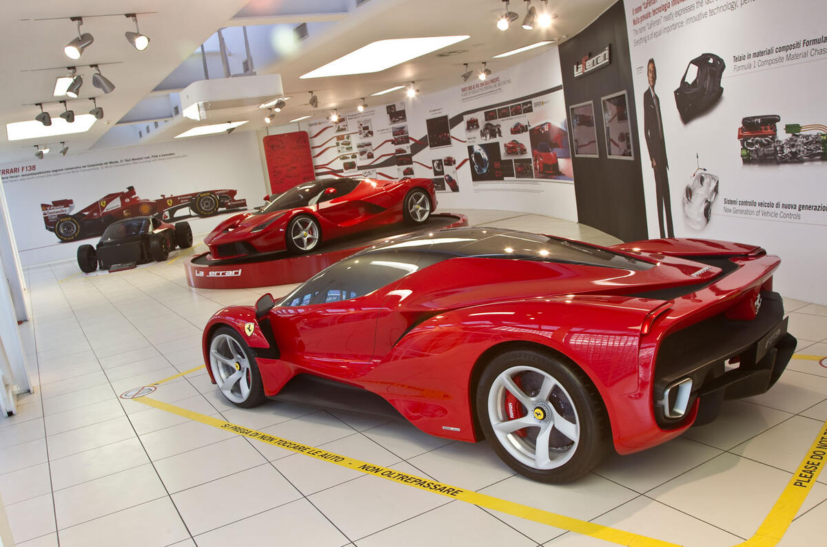
When he enters the museum that’s been created to help celebrate the car he’s just designed – the breathtakingly beautiful new LaFerrari – the atmosphere changes. Instantly. Although there’s a busload of school kids running around all over the place, none of them surely knows who he is.
But the grown-ups, the staff who run the new museum which sits just across the road from the famous factory, acknowledge Manzoni’s presence as if they are witnessing the second coming.
Ropes are hurriedly removed and some of the rowdier kids are shuffled quietly out of the way. The Man is in residence, basically, so respect from everyone present is due, with a capital ‘D’.
And then the weirdest thing happens. Flavio Manzoni, Ferrari design director and quite clearly one of the coolest dudes in the whole of Maranello, and therefore all of Italy, walks over to me, smiling, then shakes my hand and says: “Hello, Steve, how are you? I’ve been a fan of your work for many years.”
Eh? On sensing my confusion, Manzoni explains that he has been reading Autocar since the year dot and regards us as one of the best car magazines in the business. Which is a lovely thing to hear from someone so high up at Ferrari, but also a touch disarming to experience first hand.
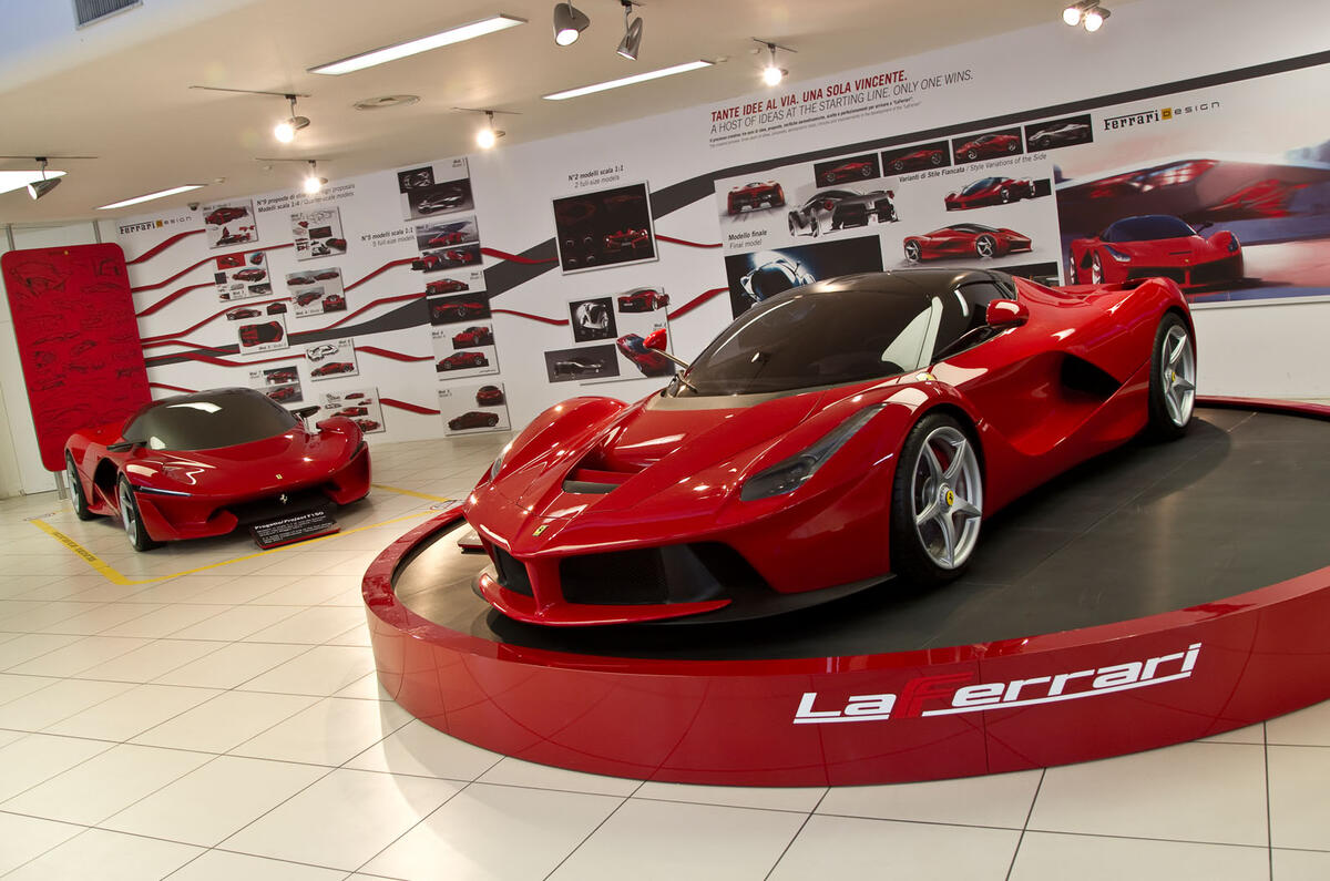
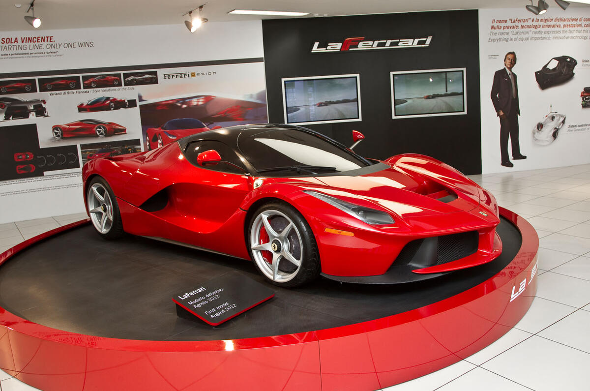
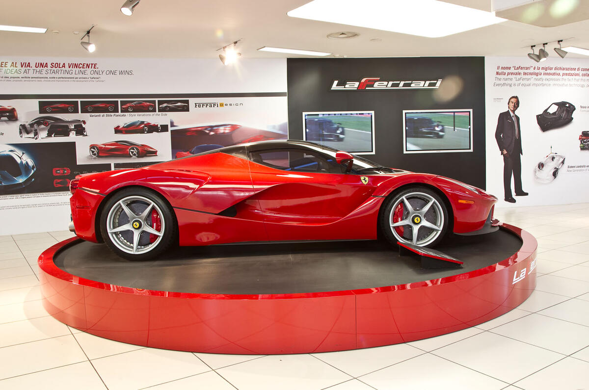
However, once the strange but pleasant round of introductions are complete, we get down to talking about the design and creation of Manzoni’s new masterpiece, LaFerrari, a gleaming full-scale clay model of which is parked next to us. At which point Manzoni goes straight into seventh gear.
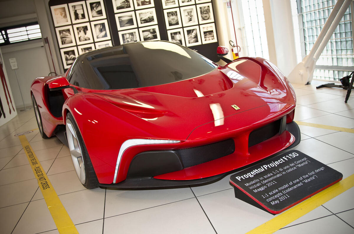
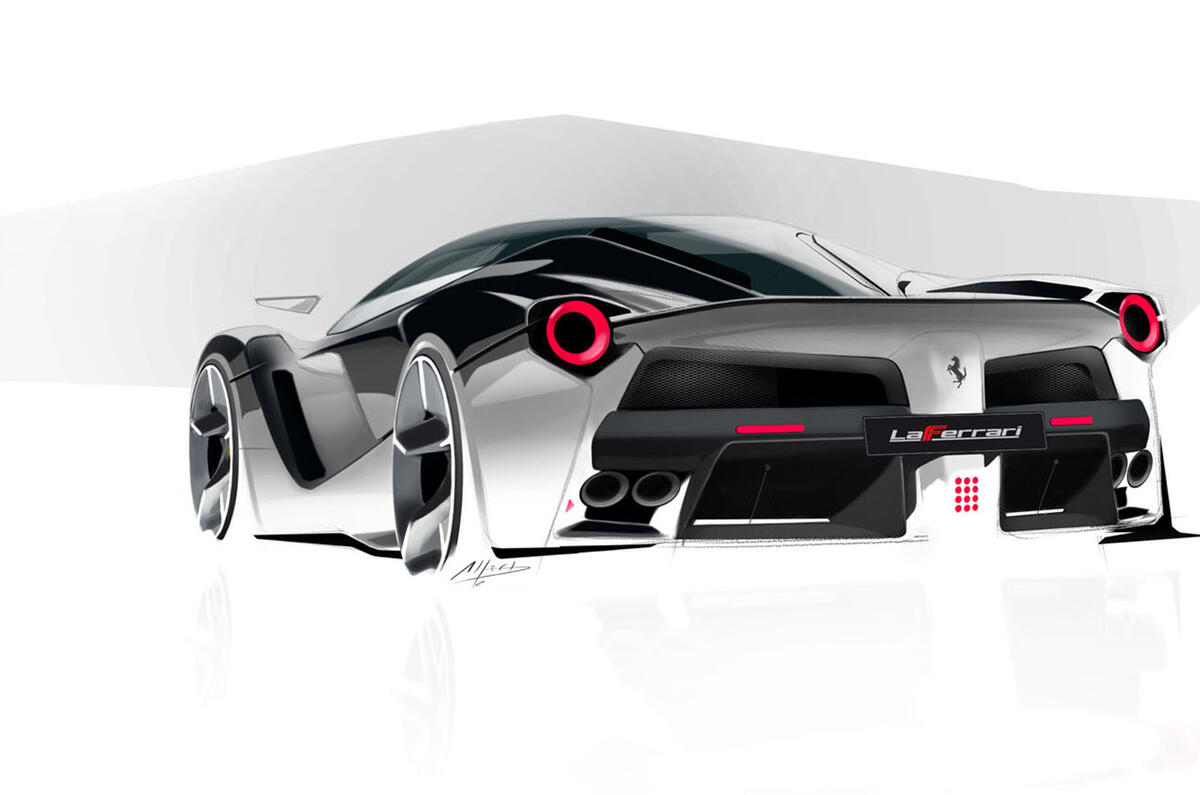
“In the beginning, in September-October 2010, we started with many different quarter-scale design concepts,” he explains. “My desire was to give a strong and very modern, futuristic taste and approach to the car – because we knew this car would be a manifesto for Ferrari. We knew we had to create a milestone.”
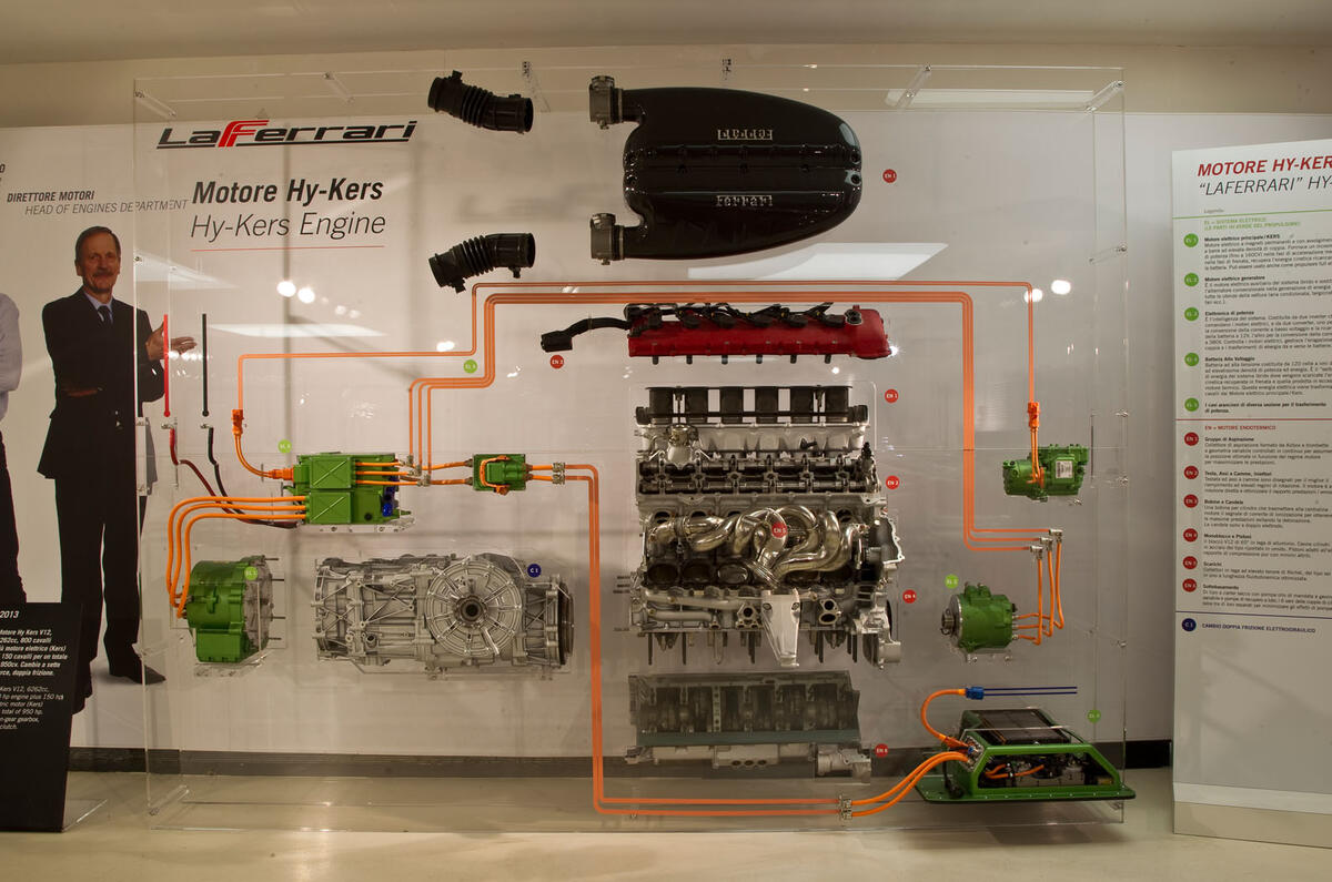
To do that, says Manzoni, the relationship between the car’s engineers and its designers had to be closer than ever before. “The interaction between the Ferrari design team and the engineering team was immediately strong, right from the beginning,” he says.
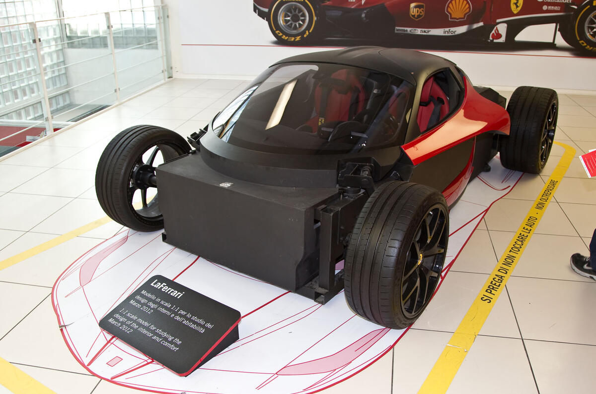
“To start with, we had a technical model developed by the pre-engineering department. It was a functional model representing all the needs regarding aerodynamics and so on, and the original idea was also to keep the car very small.
“But it wasn’t very nice to look at,” admits Manzoni. “It was a bit brutal, a little bit primitive. But once we understood the complexities of the aerodynamics of the car – for instance, the pressure to create airflow towards the side of the car and to the radiators – we could move forwards.”













Join the debate
Add your comment
The worst looking of the three
Having seen single color mules, I wonder how many will be ordered without the contrasting roof? I feel the black roof (especially on top of Ferrari red) gives the car an unbalanced, heavy-bottomed appearance. This is the first of their supercars I would like better in a dark color.
The appearance of the FLF is especially disappointing given some of the early design studies and the Mille Chilli concept. There were some very attractive concepts before this final form.
Well,